Let's upgrade (enhancement tutorial)

30 posts · 2006-02-03 09:05:45 to 2007-03-04 07:21:12

#11400010494 02/03/2006 09:05:45 Let's upgrade (enhancement tutorial)
Since Sykin has laid the ground work for enhancing in-game images, *bows to Sykin* I will be augmenting what he has taught, giving you guys things to think about to take your images as far as you want them to go. :smileyhappy:

Top get things started, we will take a look at our in-game screenshots and things we can do to enhance them, yielding near photo-realistic effects.

For photo-realism, think as a photographer...

Personally, I try to be a minimalist when it comes to using screenshots. I think the most important thing to keep in-mind with your stock screenshots is lighting. A well-lit, dynamic image will make things much easier. Light and shading gives things a sense of depth, so look for a good balance before you begin. As Aquatium says in his recent sigs..."without darkness...there is no light." :smileywink: Also, keep the direction of the light, and the type of light (sunlight, artificial light, etc.) in mind when you start.

Condensing images...

Like Sykin noted in his tutorial, once you've chosen the shot you're going to use, it's a good idea to make the image smaller, taking alot of the pixellation out. This gives you a smoother, easier image to work with. Again, the idea is to get it ready before you really start working.

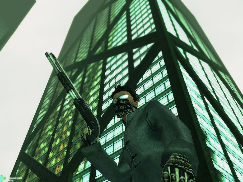
This is the image I will be using in this tutorial:

It has already been shrunk down in size. Notice there isn't much pixellation or unwanted graininess to get rid of.

Now...after all that, let's get started.

Once it's in photoshop, I duplicate the layer. We will need one for the background, and one for Dephect, the RSI.

Hide the lower layer, then use the rectangular marquee tool to isolate the RSI.

Select/Select Inverse and delete to cut away most of the background.

Use Image/adjustments/curve and lighten the picture slightly, just enough to define the RSI layer as you erase the excess away via lasso tool or eraser, etc.

Next, I cut out the RSI from the top layer. At times, it might be necessary to fill the bottom layer (background layer) with black, so you can make sure all the excess is erased.

Once that's done, note any fuzziness or unneeded angles that are there due to polygon overlapping.
ex. I used the blur tool with a soft brush to do this...


Now, make the lower layer visible.

Duplicate the layer twice. There should be 4 layers total:

RSI layer
Duplicate layer 2
Duplicate layer 1
Original layer

Use gausian blur at 1.5 px or so. This, like most things in your work is really is a matter of taste. I just figured it would be appropriate for this piece.

Use a large, soft-brush eraser to lightly fade the blurred effect on the ground, making it blur as it goes back into the distance.

This is how it should look at this point.

Now, merge the two background layers. This will give you the ability to adjust the general lighting/atmosphere of the picture without the two layers clashing, and giving you ugly shading differences. Now that we have the desired camera focus effect, the exposure can be adjusted if need be. I tend to use curves to bring an image out a bit, if it seems a little too dull. It also has a great effect with adding definition to things in the background.


More to come...next, I will be expanding on layers and how they can relate in terms of lighting blends (i.e. screen, color dodge, linear dodge, etc.)

I hope this makes some sense at least, and helps out... :smileysurprised:

Message Edited by Pyraci on 02-03-200609:33 AM

#11400010500 02/03/2006 09:40:15 Re: Let's upgrade (enhancement tutorial)
I love you.

But what option is curves under btw?
#11400010501 02/03/2006 09:46:55 Re: Let's upgrade (enhancement tutorial)
these tutorials are so awesome. i can't wait to try em out \m/ tyvm!
#11400010502 02/03/2006 09:51:49 Re: Let's upgrade (enhancement tutorial)
heheh have at it, guys!!! :smileyhappy:
Ask questions too...I'm really eager to see where this takes you all.
I'm glad you like, BPBlade :smileyvery-happy: Curves is under image/adjustments, if I'm not mistaken.
(Not really sure what happened there...I think I lagged out lol)

Message Edited by Pyraci on 02-03-200610:13 AM

#11400010503 02/03/2006 09:58:57 Re: Let's upgrade (enhancement tutorial)
Now I wait for him to edit that.
#11400010504 02/03/2006 10:31:13 Re: Let's upgrade (enhancement tutorial)
Nice one!

And who the HELL is BPBlade?
#11400010505 02/03/2006 10:34:07 Re: Let's upgrade (enhancement tutorial)
The image I tried this with didn't have a great background, so i didn't try the blurring effects for the focus, but I was able to get a better cutout of my RSI, which I will use elsewhere.

I was slightly confused about what layer to apply the blur on while reading it though. The base, or one of the copies?
#11400010507 02/03/2006 10:46:43 Re: Let's upgrade (enhancement tutorial)
nice work pyraci SMILEY , ill get round to some guides eventually too SMILEY
#11400010508 02/03/2006 10:49:13 Re: Let's upgrade (enhancement tutorial)


PBlade wrote:
Nice one!

And who the HELL is BPBlade?


British Petroleum blade?
#11400010509 02/03/2006 10:53:29 Re: Let's upgrade (enhancement tutorial)


PBlade wrote:
Nice one!

And who the HELL is BPBlade?


It's PBlades evil twin, Bad PBlade SMILEY
#11400010523 02/03/2006 11:18:01 Re: Let's upgrade (enhancement tutorial)


Aquatium wrote:


PBlade wrote:
Nice one!

And who the HELL is BPBlade?


It's PBlades evil twin, Bad PBlade SMILEY


LMAO!!! I can't type for anything today, I swear...:smileytongue:
It's PBlade!! *smacks himself*
...and to clarify, the blur effect should be on duplicate 2 as described above. That layer will be merged with duplicate 1. Sorry for the confusion.
#11400010544 02/03/2006 14:14:46 Re: Let's upgrade (enhancement tutorial)


Traxada wrote:


PBlade wrote:
Nice one!

And who the HELL is BPBlade?


British Petroleum blade?


I'm RICH! RICH I TELLS YA!
#11400010546 02/03/2006 15:55:52 Re: Let's upgrade (enhancement tutorial)
Thanks to finally getting a decent cutout of my RSI, I can now make a decent picture of myself in the loading construct ^^


And I'm very close to figuring out how to get the light to shine on the edges of people :smileywink:
#11400010574 02/04/2006 04:06:52 Re: Let's upgrade (enhancement tutorial)

PBlade wrote:
I love you.

But what option is curves under btw?


Tsk, I *told* you it was all about the curves SMILEY
#11400010577 02/04/2006 04:47:06 Re: Let's upgrade (enhancement tutorial)
Tried out the 'blur, erase, merge!' technique on the building, I don't think it's quite as seamless as it could be but I'm pretty happy with how it turned out!
Used curves to enhance the deep colours, then Linear Burned (or was it Color Burn .. I forget) a copy of the layer with medium opacity, and used the dodge tool on the gun and glasses.
Had to blur out the Kedemoth hardline waypoint too :robotmad: :robotvery-happy:


#11400016631 03/25/2006 05:07:57 Re: Let's upgrade (enhancement tutorial)
Here's my attempt with one of my own pics. It's definately not my best work lol.
Darn I forgot to put the Ð on it Ah well, I'll add that and put it in the rotator hehe.
- Ð
#36300089174 11/05/2006 21:00:36 Re:Let's upgrade (enhancement tutorial)
heres my attempt.

still needs the wavy ripple effect thingy, but oh well


Photo Sharing and Video Hosting at Photobucket
#36300129506 12/29/2006 02:25:40 Re:Let's upgrade (enhancement tutorial)

BulletTime is basically created by changes in air pressure causing distortions in the light.

Shading is inferior to MY S3x0R METHOD! XD

Photoshop Tutorial: BulletTime ripple effect [Lots of images!]

Here's a sample from the tutorial:

Archived image unavailable: album_thumbnailcaa0.html
25.jpg

And here's one I prepared earlier (just after the release of CR2.0):

Enjoy.

phiAU - The Kings of Never - noblesse oblige
#36300138190 01/11/2007 07:38:37 Re:Let's upgrade (enhancement tutorial)
Excellence, Phi. SMILEY Very useful tutorial indeed.

Skin Tutorial - Part 1

This will be a three-part tutorial focusing on pulling out the realistic skin textures that already embedded within our RSI's though our artwork. Please note that with most things in art and photo/screenshot manipulation, lighting is fundamental and will be addressed first. That said, I(personally) take screenshots without overbright and green tint settings on. I also set my screenshot capture quality settings to 100. For more information on useropts.cfg and options.cfg files, please see Bayamos' More Useropts Options thread.


I've taken a shot of my friend Betty and placed her RSI on a new layer (In this case, a white background to focus on the RSI rendering).


For darker screenshots and night time shots like this one, I usually use Image-adjustments-curves (ctrl+m) to brighten the image without losing too much of the texture information.

For instance, I used this setting:


Yielding the following result:


*keep in mind that the intensity of the curves tool will differ depending on the amount of light desired. (i.e. much lighter or daytime shots may need little to no curves adjustment.

Next, we're going to try to bring the texture and contrast out in the skin tone. That will be done by using Image-adjustments-Hue/Saturation (ctrl+u). I've found that setting the saturation down to about -30 or so gives as suitable effect.


Now the textures are starting to come out, but leave the overall image dull.


Now I use Image-adjustments-Brightness/Contrast to make the image more vivid:


*Note that this again is a matter of personal preference and composition of the image, and steps 3 and 4 can be done repeatedly as needed if initially unhappy with the results.

This should get you ready for trimming the excess around the RSI(If not done so already), as well as other revisions/refinements.


The next part of this tutorial will deal more with hue and pigmentation of the skin.


#36300138201 01/11/2007 07:52:30 Re:Let's upgrade (enhancement tutorial)

Awesome work Py, as usual.

Sorry to 'break' your tutorial, bu I have a couple of questions: why use Curves to adjust the image, instead of simply using Contrast/Brightness adjustments? What does it do differently? And, what feathering do you have your selection tool set at? Or do you manually select pixels?

Thanks!

#36300138226 01/11/2007 08:14:22 Re:Let's upgrade (enhancement tutorial)
Oh, questions like these are encouraged with my tutorials. Better to ask questions as we move along, I say. SMILEY

I tend to use curves to be more subtle in bringing the image out, so to speak. This way, I can brighten an image without overexposing it and removing some of the texture. Notice the transition with curves is a bit smoother than the one with Brightness/Contrast. That and I also try not to saturate the colors(which Brightness/Contrast tends to do) until I make the adjustment with Hue/Saturation. I've found that it gives me more control over the texture as a whole. Also, the pixels selected for this part of the tutorial were done manually with the rectangle marquee to quickly isolate the image. I am currently taking away the excess part with the background and softening the polygonal edges for the next part.
#36300138308 01/11/2007 09:15:57 Re:Let's upgrade (enhancement tutorial)
Pyraci, my good man. We're on precisely the same wavelength. I employed the exact same method on this image.


However. I tend to have Green tint on ingame, and simply remove it with Color Balance in Photoshop.


After that, I desaturate it a bit, then alter the contrast.

That usually leaves me with the base image that I go to work on. And the outcome became:


#36300138316 01/11/2007 09:29:18 Let's upgrade (enhancement tutorial)

PBlade, that final shot is much better than the version you showed me,


The necklace and shirt dont look as jagged, and if im honest i didnt even see it like i did on the other one,

The contrast settings aswell give it a really nice touch i think, dark...bit like a machine


Awesome work dude, its a nice imporvement well done

#36300139028 01/12/2007 04:00:11 Re:Let's upgrade (enhancement tutorial)
PBlade, my friend. You've given me an idea to use here, with the color balance adjustment. SMILEY

Part 2

At this point, I’ve gone back and cleaned the image up a bit by removing the excess pixels and smoothing some of the outline out.


Now that we have the pigmentation of the skin that we want, let’s add a little warmth back into her skin tone and her clothes in this case by duplicating the RSI layer and using Image-adjustments-Color Balance. (ctrl+b) Doing this on a separate layer will allow for blending changes and more flexibility with the tone than applying it directly.

Here is an example of the color balance settings used. I did the same for shadows, midtones, and highlights. Again, this must be used with some discretion, as the skin tone desired may be different in some compositions.


Once the desired tone is reached, change the layer’s blend style to hue, settling the tone of the skin and clothes where they need to be. Merge the layers.


This frees us up to work on the finer points of the skin like shading, which will be covered in the third part of this tutorial. At which point, the smallest things can affect the image greatly. Just look at an eye overlay does to this:


#36300139031 01/12/2007 04:09:15 Re:Let's upgrade (enhancement tutorial)
Nice work on that guide, I will point out that balance of clothes colors as well as skin tone based on color balance can be an issue because of the complete edit it does on the whole picture. I can't stress enough to practice firstly seperating all the layers to edit them independantly, sure its a longer process, but the results yeild can make a big difference. Im my RSI edits I tend to have several layers, Skin , Front Hair, Back Hair, Eyes, Clothes, etc etc. Then you can manipulate the image settings based on each layer, and history tool is great to connect everything flawlessly.
#36300139036 01/12/2007 04:17:12 Re:Let's upgrade (enhancement tutorial)
hehe Yes, good point. This last part is where I do my layer work. As Aquatium said, a masterful enhancement will usually have extensive work done to several parts separately and thus, need separate layers in the process. I'm going to demonstrate a process I call "folding" that utilizes this technique in the third and subsequent parts of RSI enhancement.
#36300139450 01/12/2007 13:26:55 Re:Let's upgrade (enhancement tutorial)
Excellent as always, Pyraci.


- Check your PM's. =P
#36300179461 03/04/2007 05:42:55 Re:Let's upgrade (enhancement tutorial)
Pyraci, I need the third step of your awesome tutor! :-O


P.S.: What's the "hue" blend style? I have the german version of PS and reading through english tutors is sometimes cryptic o.O
#36300179504 03/04/2007 06:41:12 Re:Let's upgrade (enhancement tutorial)
GoDGiVeR wrote:


P.S.: What's the "hue" blend style? I have the german version of PS and reading through english tutors is sometimes cryptic o.O
Haha, well that's problematic.
I highly suggest reinstalling Photoshop and choose English instead, most of the tutorials on the internet are in english.

If not, here's the "hue" blend style:


I'm guessing it's in the same position just in german.

Also, nice tutorial Pyraci.
#36300179523 03/04/2007 07:21:12 Re:Let's upgrade (enhancement tutorial)
Thanks SMILEY

Man, I need to get back to this one...