As long-time readers here will know, I'm rather fond of Photoshop's "Threshold" function, which converts a color or grayscale image into a stark black and white image, using an adjustable slider that lets you set the b/w transition point.
When I had to come up with something to use for static images in the Loading Area's "cinematics" screen, I experimented a bit and came up with a very simple method of layering multiple Thresholds of the same image to get a nice and dirty, high-contrast, sort of cel-shaded look from screenshots. You've probably seen me playing with it a bit on old screenshots in the "Assorted screenshots" thread. So, here's a little tutorial (based on my dear old Photoshop 4--specific details may work slightly differently in different versions of Photoshop) on how I used it to make the 10.3 chapter image that came up in update 61:
1) Source image
First, you need a source image to work from. For smoother results, start with one at as high a resolution as you can capture, and that hasn't been jpeg compressed, because the artifacts in a jpegged image will produce noise in the threshold results, especially when you set the Threshold slider to a high value. That isn't always a bad thing, but just something to keep in mind.
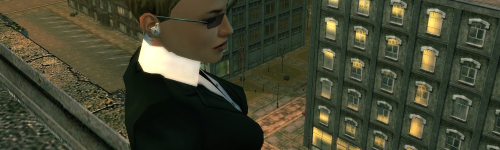
My original for this was 1600x1200, but in the interests of screen space here, I'll start with a half-size version of it, or 800x600:

(That was taken last week in Creston Heights on Vector, incidentally.)
2) Threshold it
There are many ways to do this in Photoshop (copying the image into layers, reloading the image, and using either Threshold layers, or the Threshold function, etc, etc), but essentially you're just going to use Threshold on the source image three times, at varying levels.
For this particular technique, you want to Threshold it once to get the deep shadows, Threshold it once to get the middle range, and Threshold it once to get highlights. These different ranges are just different numbers along the slider in the Threshold window. I like to jiggle the slider around until it reveals interesting shapes on the surfaces. What values you use will also vary based on what kind of overall contrast and brightness you're going for in the final composited image.
Here are the three I decided on for this particular image:
3) Threshold 1: Black

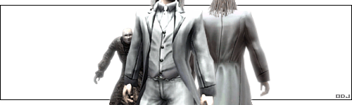
This first Threshold, using a low value, will look very washed-out, but the surviving dark areas will be the deepest blacks in the final image. With this one you want to preserve the most essential lines, and deepest shadows; here those were: the main figure's eyebrows, eyes, the shadow under her bust, the lines on the building, the dark field around the OUROBOROS logo, and the outlines of the two guards. The Threshold value of 40 did this nicely. Save this off or preserve it in a layer somehow.
3) Threshold 2: Mid-range

This middle one will be the one that really gives a sense of volume to the final image, so you want to try to get it to put lines across the middle of curved surfaces. Make sure you're starting from the source image, NOT from the thresholded image you just did in the previous step! A Threshold operation on the source image at value 55 caught the curves above her eyes, and on the main figure's arms and torso. It also began to fill in some patterning on the building in the background. Save this off or preserve it in a layer somehow. You should have two black and white versions of your source image now.
4) Threshold 3: Highlights

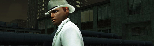
This last Threshold on the original source will look very dark, but the remaining white areas will be the very brightest highlights in the final image. I tried to get it to where it showed a strong feeling of directional light across the side of her face, the barest hint of curves on her chest, and the bright parts of the reflections on the windows of the building in the background. For this particular source image, a Threshold value of 89 seemed to strike a good balance. Save this off or preserve it in a layer somehow.
In catching Shadows, Mid-range, and then Highlights, we've been using increasing Threshold values on the source image (moving the Threshold slider farther and farther to the right). We now have three black and white versions of the source image. All we have to do now is combine them.
5) Combine the results
Put your three Threshold results into three separate layers, one on top of the other. Set the top one to Opacity 33%, the middle one to Opacity 50%, and the bottom one to Opacity 100%. This results in each of them blending with equal weight to form a combined, four-color grayscale image:

In Photoshop, when I want to combine layers to get a composite that I'm going to work with a little more, I usually SAVE THE IMAGE AS A PSD WITH ALL THE LAYERS, then just Flatten the image to mash all the layers into one, then CTRL+A to select the whole layer, and CTRL+C to copy it to the Clipboard. Then I Revert the image so that all my layers come back, in case I want to fiddle with them some more later. As usual, Photoshop gurus will have better ways of doing these things than my old brute-force methods.
6) Shrink it
Threshold always produces pure 2-color black and white results, with no grays along the edges, so your combined image will look really jaggy. To smooth it out, just scale the image down by 50%. In this example, we're going from 800x600 to 400x300:

I actually use the freeware program IrfanView to scale things down, because it has an option to use what's called the Lanczos algorithm to resize bitmaps, which gives really lovely results. Photoshop does a perfect adequate job, though, if you just want to stick with that. In any case, make sure you use a scale method that resamples the image, and you should end up with nice smooth lines, and no more jaggies.
7) Optional: playing with opacity/contrast
The 33/50/100% opacities we combined together give a regular four-color result. If you want to get different levels of brightness or contrast, you can simply use different opacity values, and change the order of the three thresholded layers before combining them in step 5 above. Just make sure to keep the bottom of the three layers at 100% opacity before you combine them.
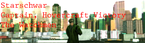
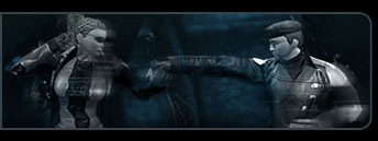
For instance, when I did the actual chapter 10.3 image, I hadn't quite worked out all the math on the opacity levels, and instead of 33/50/100% opacity settings that give the even 4-color grayscale, I was using 50/50/100%. This gives double weight to the top layer, and you can try each of the three layers on top to see what different kinds of resulting combination you get. I had the Shadows one on top (the whitest one) at 50%, the mid-range one in the middle at 50%, and the Highlights one (the darkest one) on the bottom, at 100%. That gives this result, which you'll notice is brighter overall, since the white areas of the Shadows layer were given twice as much weight as normal:

8) Letterbox it
If you really want to get that cinematic feel, crop the image's height down so that the resulting width/height ratio is 16/9, which is what "high-def" uses. Hm there's another, even wider ratio that some movies use, but I forget what that one is; anyway, I like 16x9. :P This takes a little math to figure out:
Current width times 9, divided by 16, equal the new height.
In this example, with a 400-pixel width, we get
400 * 9 / 16 = 225
So, crop the height of the image to 225 if you want a nice 16x9 ratio. I then set the Canvas Size back to a height of 300, with a black background color selected, to get the black letterboxing bars on there, just for fun:

And that's it. One thing I could mention too is that since the individual Threshold layers are very simple black and white images, they're easy to edit, so you can pretty easily remove unwanted details, change the shapes of lines, add new elements, and so forth.
Oh, also, for low-bandwidth web-posting, you can change the Image > Mode to Indexed Color, using Palette = Exact, then File > Export it as a GIF.
~~~~~~~~~~~~~
Getting a little more in-depth:
I found that one handy way to play with the Threshold values on the fly is set your Threshold and source copy layers up in a big stack, with 33/50/100 opacity on the source copies, and then set the Threshold layers to only affect the layer below them. For instance:

A fairly quick way to do this in Photoshop (4 :p) is to copy the source image twice, then select each of the three in turn. When you have one selected, hold CTRL, click the New Layer button (the turning page icon at the bottom), and select Threshold for the Type and check the "Group With Previous Layer" box in the Adjustment Layer window that appears.
When I had to come up with something to use for static images in the Loading Area's "cinematics" screen, I experimented a bit and came up with a very simple method of layering multiple Thresholds of the same image to get a nice and dirty, high-contrast, sort of cel-shaded look from screenshots. You've probably seen me playing with it a bit on old screenshots in the "Assorted screenshots" thread. So, here's a little tutorial (based on my dear old Photoshop 4--specific details may work slightly differently in different versions of Photoshop) on how I used it to make the 10.3 chapter image that came up in update 61:
1) Source image
First, you need a source image to work from. For smoother results, start with one at as high a resolution as you can capture, and that hasn't been jpeg compressed, because the artifacts in a jpegged image will produce noise in the threshold results, especially when you set the Threshold slider to a high value. That isn't always a bad thing, but just something to keep in mind.
My original for this was 1600x1200, but in the interests of screen space here, I'll start with a half-size version of it, or 800x600:
(That was taken last week in Creston Heights on Vector, incidentally.)
2) Threshold it
There are many ways to do this in Photoshop (copying the image into layers, reloading the image, and using either Threshold layers, or the Threshold function, etc, etc), but essentially you're just going to use Threshold on the source image three times, at varying levels.
For this particular technique, you want to Threshold it once to get the deep shadows, Threshold it once to get the middle range, and Threshold it once to get highlights. These different ranges are just different numbers along the slider in the Threshold window. I like to jiggle the slider around until it reveals interesting shapes on the surfaces. What values you use will also vary based on what kind of overall contrast and brightness you're going for in the final composited image.
Here are the three I decided on for this particular image:
3) Threshold 1: Black
This first Threshold, using a low value, will look very washed-out, but the surviving dark areas will be the deepest blacks in the final image. With this one you want to preserve the most essential lines, and deepest shadows; here those were: the main figure's eyebrows, eyes, the shadow under her bust, the lines on the building, the dark field around the OUROBOROS logo, and the outlines of the two guards. The Threshold value of 40 did this nicely. Save this off or preserve it in a layer somehow.
3) Threshold 2: Mid-range
This middle one will be the one that really gives a sense of volume to the final image, so you want to try to get it to put lines across the middle of curved surfaces. Make sure you're starting from the source image, NOT from the thresholded image you just did in the previous step! A Threshold operation on the source image at value 55 caught the curves above her eyes, and on the main figure's arms and torso. It also began to fill in some patterning on the building in the background. Save this off or preserve it in a layer somehow. You should have two black and white versions of your source image now.
4) Threshold 3: Highlights
This last Threshold on the original source will look very dark, but the remaining white areas will be the very brightest highlights in the final image. I tried to get it to where it showed a strong feeling of directional light across the side of her face, the barest hint of curves on her chest, and the bright parts of the reflections on the windows of the building in the background. For this particular source image, a Threshold value of 89 seemed to strike a good balance. Save this off or preserve it in a layer somehow.
In catching Shadows, Mid-range, and then Highlights, we've been using increasing Threshold values on the source image (moving the Threshold slider farther and farther to the right). We now have three black and white versions of the source image. All we have to do now is combine them.
5) Combine the results
Put your three Threshold results into three separate layers, one on top of the other. Set the top one to Opacity 33%, the middle one to Opacity 50%, and the bottom one to Opacity 100%. This results in each of them blending with equal weight to form a combined, four-color grayscale image:
In Photoshop, when I want to combine layers to get a composite that I'm going to work with a little more, I usually SAVE THE IMAGE AS A PSD WITH ALL THE LAYERS, then just Flatten the image to mash all the layers into one, then CTRL+A to select the whole layer, and CTRL+C to copy it to the Clipboard. Then I Revert the image so that all my layers come back, in case I want to fiddle with them some more later. As usual, Photoshop gurus will have better ways of doing these things than my old brute-force methods.
6) Shrink it
Threshold always produces pure 2-color black and white results, with no grays along the edges, so your combined image will look really jaggy. To smooth it out, just scale the image down by 50%. In this example, we're going from 800x600 to 400x300:
I actually use the freeware program IrfanView to scale things down, because it has an option to use what's called the Lanczos algorithm to resize bitmaps, which gives really lovely results. Photoshop does a perfect adequate job, though, if you just want to stick with that. In any case, make sure you use a scale method that resamples the image, and you should end up with nice smooth lines, and no more jaggies.
7) Optional: playing with opacity/contrast
The 33/50/100% opacities we combined together give a regular four-color result. If you want to get different levels of brightness or contrast, you can simply use different opacity values, and change the order of the three thresholded layers before combining them in step 5 above. Just make sure to keep the bottom of the three layers at 100% opacity before you combine them.
For instance, when I did the actual chapter 10.3 image, I hadn't quite worked out all the math on the opacity levels, and instead of 33/50/100% opacity settings that give the even 4-color grayscale, I was using 50/50/100%. This gives double weight to the top layer, and you can try each of the three layers on top to see what different kinds of resulting combination you get. I had the Shadows one on top (the whitest one) at 50%, the mid-range one in the middle at 50%, and the Highlights one (the darkest one) on the bottom, at 100%. That gives this result, which you'll notice is brighter overall, since the white areas of the Shadows layer were given twice as much weight as normal:
8) Letterbox it
If you really want to get that cinematic feel, crop the image's height down so that the resulting width/height ratio is 16/9, which is what "high-def" uses. Hm there's another, even wider ratio that some movies use, but I forget what that one is; anyway, I like 16x9. :P This takes a little math to figure out:
Current width times 9, divided by 16, equal the new height.
In this example, with a 400-pixel width, we get
400 * 9 / 16 = 225
So, crop the height of the image to 225 if you want a nice 16x9 ratio. I then set the Canvas Size back to a height of 300, with a black background color selected, to get the black letterboxing bars on there, just for fun:
And that's it. One thing I could mention too is that since the individual Threshold layers are very simple black and white images, they're easy to edit, so you can pretty easily remove unwanted details, change the shapes of lines, add new elements, and so forth.
Oh, also, for low-bandwidth web-posting, you can change the Image > Mode to Indexed Color, using Palette = Exact, then File > Export it as a GIF.
~~~~~~~~~~~~~
Getting a little more in-depth:
I found that one handy way to play with the Threshold values on the fly is set your Threshold and source copy layers up in a big stack, with 33/50/100 opacity on the source copies, and then set the Threshold layers to only affect the layer below them. For instance:
A fairly quick way to do this in Photoshop (4 :p) is to copy the source image twice, then select each of the three in turn. When you have one selected, hold CTRL, click the New Layer button (the turning page icon at the bottom), and select Threshold for the Type and check the "Group With Previous Layer" box in the Adjustment Layer window that appears.