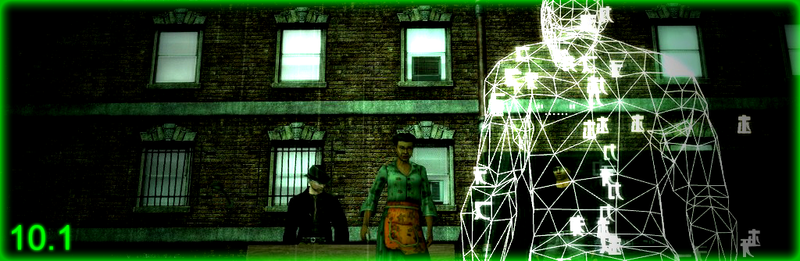
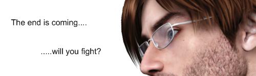
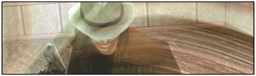
Cinematic 10.1
15 posts · 2008-04-30 15:21:39 to 2008-04-30 22:02:46
Looks a lot like the vector one, just with no voices.

Wwwwrong place.
GJ on it keep em coming!!
GJ on it keep em coming!!
Does look good, but one of the main things I liked about the Cinematics is it showed something that didn't happen in a Live Event.

Are we all watching the same thing here? o.O This was worse than the one Vector made.
4 8 15 16 23 42
"My art teacher would totally rip that up."?
Zudrag wrote:
The following is a more expanded view of my opinion of the 'cinematic'.
Breakdown of mistakes made with the video:
Oh and my art teacher would totally rip that up.
Totally.
"My art teacher would totally rip that up."?And this ladies and gents is where expressing your personal opinion gets you on these boards.
The following is a more expanded view of my opinion of the 'cinematic'.
Breakdown of mistakes made with the video:
- Images are all different sizes resulting in large areas of black empty space.
- Subtitles are done using a pre-set on an editing program you should always change the default never leave it as it is for everyone.
- The colour of the subtitles went to odd colours sometimes and were hard to read.
- The font used on the subtitles was contrasting with the overall feel of the pictures and music.
- Some subtitles are put in awkward positions and cover the important part of the pictures.
- Transitions from picture to picture are basic and remind me of MS Powerpoint.
- Animations of some of the text are way to cartoon like and contrast with the seriousness of the music.
- There was no actual video in the video, making this at best a slide show.
Oh and my art teacher would totally rip that up.
Totally.
4 8 15 16 23 42
Honestly, I'm glad we have community members that are willing to contribute videos such as these. On that note, it was pretty boring. Look I understand that you didn't have much to work with, but in this scenario there was really no need to make a video. I found it much more enjoyable observing and reading the screens from Rarebit. I agree with most of odj's criticisms as well.
Even in the few cases of cinematics being based off of recent events, they were still of a high quality. I support player made chapter-cinematics, but they should be more than cropping a few images and inserting music and text.
I'm not trying to offend anyone because I know how it feels to have your work rejected. I'm just trying to give criticism.
*double post, woohoo!*
odj wrote:
Subtitles are best kept in the lower-third portion of the video.
I guess the point of this was to go for the feel of the "newer" style cinematics, but my main issue was the subtitles. Seemed just like they were all over the place at times.
Zudrag wrote:That looked a LOT like Powerpoint. What was this edited with? That didn't look like Final Cut, Avid, or Premiere. Way too basic to be any of those."My art teacher would totally rip that up."?And this ladies and gents is where expressing your personal opinion gets you on these boards.
The following is a more expanded view of my opinion of the 'cinematic'.
Breakdown of mistakes made with the video:I liked the music.
- Images are all different sizes resulting in large areas of black empty space.
- Subtitles are done using a pre-set on an editing program you should always change the default never leave it as it is for everyone.
- The colour of the subtitles went to odd colours sometimes and were hard to read.
- The font used on the subtitles was contrasting with the overall feel of the pictures and music.
- Some subtitles are put in awkward positions and cover the important part of the pictures.
- Transitions from picture to picture are basic and remind me of MS Powerpoint.
- Animations of some of the text are way to cartoon like and contrast with the seriousness of the music.
- There was no actual video in the video, making this at best a slide show.
Oh and my art teacher would totally rip that up.
Totally.
Subtitles are best kept in the lower-third portion of the video.
I guess the point of this was to go for the feel of the "newer" style cinematics, but my main issue was the subtitles. Seemed just like they were all over the place at times.
odj wrote:
i think hes already got his hands full with thehair grass tutorial <_< >_>

Oh and my art teacher would totally rip that up.
Totally.
i think hes already got his hands full with the
Tseng. wrote:
odj wrote:Not your normal quality, I'm disappointed Tseng...
Oh and my art teacher would totally rip that up.
Totally.
i think hes already got his hands full with thehairgrass tutorial <_< >_>
ya the teachers probly on his way to come rip me up
Nice try. Biggest problem was really fast and hard to read subtitles.