Since the other thread had over 1000 posts I figured it would be best to make a new one before we broke the forums.
Here is a link to the old thread.
Rate my sig v3.0
225 posts · 2007-12-27 12:52:23 to 2009-05-29 10:10:24
 Helpful Links:
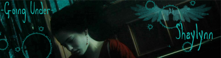
 7/10 Kinda plain, but I still like it somewhat. 
Your RP sucks, not your sig, though. 11/10 for the sheer awesomeness although they locked that epic thread. FFS leave that thread alone!!!1111

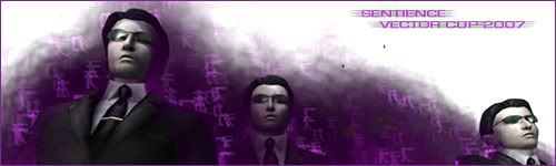
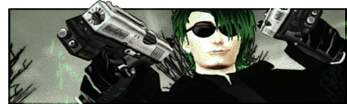
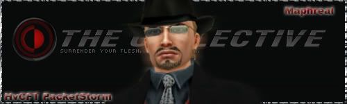
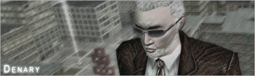
10/10 GodGiver, that image was just epicly awesome!
I just made two signatures, and wondered if you could let me know what you think..


I just made two signatures, and wondered if you could let me know what you think..
Havocide wrote:
8/10. I really like this one. The eye is awesome ^_^
10/10 GodGiver, that image was just epicly awesome!
I just made two signatures, and wondered if you could let me know what you think..
8/10. I really like this one. The eye is awesome ^_^
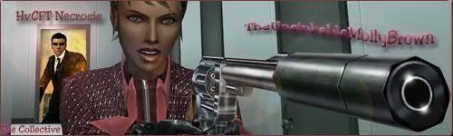
I'll not rate the image, but rather the use of it as both sig and avatar. Very clever, Spha. 9/10
**Edit**
Careful. Telling people to leave Neo alone locks threads. 9/10
**Edit**
Careful. Telling people to leave Neo alone locks threads. 9/10
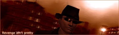
Haigen Looks Hawt, but Pyraci your looking kinda rough maybe you need some sleep? 9/10
Rate This one:

Rate This one:
I like it, bit too dark but your timing makes up for it. 9/10
That one really brings the point across Reeverb 9/10 for originality though 
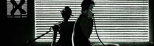
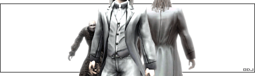
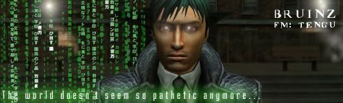
I don't get the big code cube on the right side, but the image is pretty high quality. Text could be done better. 5/10
Kybutra wrote:
The font in Fara's sig is secks, just like the rest of the frames. 9.5/10
Haigen Looks Hawt, but Pyraci your looking kinda rough maybe you need some sleep? 9/10Indeed. I may be open to suggestion.
The font in Fara's sig is secks, just like the rest of the frames. 9.5/10
Pyraci wrote:
And yes, you get a 8.7/10 I don't like the caption, nor the text-style =/
Kybutra wrote:A tip, it's NOT blue. You can get it from many people, especially Chloe. No, not -that-. I meant a good slap in your face!Haigen Looks Hawt, but Pyraci your looking kinda rough maybe you need some sleep? 9/10Indeed. I may be open to suggestion.
And yes, you get a 8.7/10 I don't like the caption, nor the text-style =/
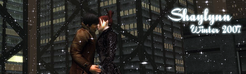
10/10. I absolutely love the snow effects, fantastic job.
This one's just a quick one i whipped up. Was tired of the Halloween one.
This one's just a quick one i whipped up. Was tired of the Halloween one.
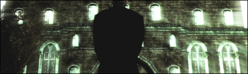
I like it: 7/10. You get kind of tired of seeing buildings in MxO and in screenshots but the quality, lighting, snow and even the lights in the windows all work together to make this sig something I'm happy to see.
An cool unique sig you have there 9/10
I am leaving xmas behind now but keeping with the theme from one of them.... with a little bit of a special one too


Eleutherophobia wrote:
Hooray, a K-Y Butra sig!(Actually it was done by Insertion, copying Kybutra's style.)
SolidRevolver wrote:
11/10
rate two new sigs that I made
10/10 for the one without the name, looks like you came upon something awesome there, love the effects you have on it.
8/10 for the one with the name, sorry, the font just doesn't fit at all, it's more of a distraction than anything.
8/10 for the one with the name, sorry, the font just doesn't fit at all, it's more of a distraction than anything.
Tenshi wrote:
10/10 for the one without the name, looks like you came upon something awesome there, love the effects you have on it.
8/10 for the one with the name, sorry, the font just doesn't fit at all, it's more of a distraction than anything.
Holy *poop* I love that sig.
10/10 up in this biznatch.

MxO-PhanthomZtryker wrote:
Tenshi wrote:that sig is pretty cool man10/10 for the one without the name, looks like you came upon something awesome there, love the effects you have on it.
8/10 for the one with the name, sorry, the font just doesn't fit at all, it's more of a distraction than anything.Holy *CENSORED* I love that sig.
10/10 up in this biznatch.
Tenshi wrote:
Eh, I've always sucked at text anyway.
10/10 for that sig
9/10 for PZ's (me no like blue)
and I don't get what's in the sig above :p
10/10 for the one without the name, looks like you came upon something awesome there, love the effects you have on it.
8/10 for the one with the name, sorry, the font just doesn't fit at all, it's more of a distraction than anything.
Eh, I've always sucked at text anyway.
10/10 for that sig
9/10 for PZ's (me no like blue)
and I don't get what's in the sig above :p
Tenshi is right, better without the text: 9/10
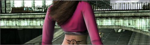
I have added 6 images to my rotar, yep, 6 more flexible girls for your enjoyment


ObliGoblin wrote:
Totally inappropriate CCR/10
Screw that. 10/10
love em all!
likez, rate my sig
Screw that. 10/10
Hawtness, love the fireworks.
10/10
10/10


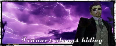
In spirit of the epic RP ones, but going for a more "If MXO was The Matrix."
 "The End is Near, the Time is Now." | W4rbl4de | Reviled Restoration-CYPHERITES
haha 10/10 for funniness XD
here my new sig, made by Kybutra
here my new sig, made by Kybutra
Ok that's really hot. 9/10 Just needs the pink on the eye to match with the pink on the sig to get 10/10 
4 8 15 16 23 42
Not going to even go there/10


My sigs from newest to oldest.
My sigs
from newest to oldest.
Funny...I like your oldest best. It get's a 9/10

The top one has a good concept. The eyes look god and the code is blended in well both on the background and behind the character. The text for your name could be better fitted to the green color theme similar to the text at the bottom of the code, but I dislike text on sigs anyways, hence my own very small name on my sig, so ignore that comment. The background could use some contrast/brightness, but otherwise looks good and simply. The RSI looks nice and really brings focus to it. Overall 7/10.
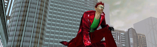
I really like the bottom one. You did a very good job creating an illusion of depth with the code placed on the background walls, and the red theme fits very well with the RSI in the foreground. You seem to have a good grasp on portrait type sigs, and I like that. The RSI is, again, well done down to the eye coloring and scar on the eyebrow. You used what looks to be a bit of contrast on the background, and that's good. A lot of people like to overdue it (myself included) but you kept a good balance. I'm also a fan of light, thin borders that fit the color scheme. Overall: 9/10.
I really like the bottom one. You did a very good job creating an illusion of depth with the code placed on the background walls, and the red theme fits very well with the RSI in the foreground. You seem to have a good grasp on portrait type sigs, and I like that. The RSI is, again, well done down to the eye coloring and scar on the eyebrow. You used what looks to be a bit of contrast on the background, and that's good. A lot of people like to overdue it (myself included) but you kept a good balance. I'm also a fan of light, thin borders that fit the color scheme. Overall: 9/10.
twicethepride wrote:
Madness...
zomg rate mah sigs.
#1 7/10... the code should be more settle...
# 2 9/10 love the scarlet red intensity
rate my sig

Ya skipped over me, EG. :/
The background is very well done as well as the cutting out and pasting of the RSIs. The blending is very well done. The only thing I could think of that detracts is the border. Red fits the theme, but for some reason, at least in my eyes, it draws attention away from the sig itself. Overall 10/10. The concept is original, fresh, and well done.
The background is very well done as well as the cutting out and pasting of the RSIs. The blending is very well done. The only thing I could think of that detracts is the border. Red fits the theme, but for some reason, at least in my eyes, it draws attention away from the sig itself. Overall 10/10. The concept is original, fresh, and well done.
Very good shot. 9/10
And I'm glad you replaced that avatar, it gave me the creeps.
New one:

And I'm glad you replaced that avatar, it gave me the creeps.
New one:
GoDGiVeR wrote:
Very good shot. 9/10
And I'm glad you replaced that avatar, it gave me the creeps.
New one:
holy :O
9/10


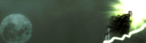
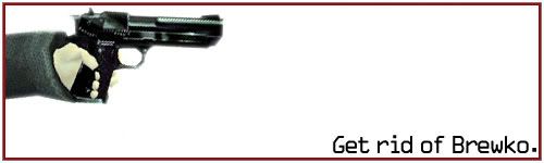
I love that one, uber weapon ftw! Definately a solid 7, awfully tempted to edit to 8 (but I'm not an overly good judge of such things so ![]() )
)
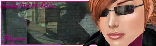
Keeping in with the girly theme, my current sig is one I've put up as a part of me having the femme fatale rank here. I designed another one, yet I'm wondering it if's a touch too naughty to use as a sig... ![]()
Anyway, here you go (note, done quickly on paint as I'm not on my normal PC, so no photoshop for me...)

Although suggestive, forum guidelines say no nudes. So I approve the sig! 9/10.
-
And Obli, as a sidenote I always found it to be lol that revolvers and shotguns in-game would have silencers. 8/10.
-
And Obli, as a sidenote I always found it to be lol that revolvers and shotguns in-game would have silencers. 8/10.
"The End is Near, the Time is Now." | W4rbl4de | Reviled Restoration-CYPHERITES
TheUnknownShadow, I approve =P 8/10
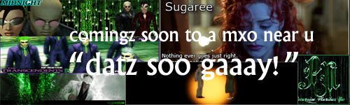
ObliGoblin - All good not so keen on the Sugaree one too bright for my liking but in general 9/10
GoDGiVeR - Jebus, thats good sh1t! 10/10


8/10 for all but one there Matt
This is quite literally tehsex/10
-----------------------------------------------------------------------------------------------


This is quite literally tehsex/10
-----------------------------------------------------------------------------------------------
Why thank you very much, what makes that one more special to me is that the silhouette is me doing a round house.
(Im a kickboxer)
Liking your stuff too, I need to get some decent pictures of my RSI and give it a crack me thinks. 8/10 for your 3 above
Howzaat
A bit small, but I like the border and the way the RSI is on the outside of it. 8/10 
I made this for Mephistoo:

without border

with border
Whatcha think?
- Ðragonram
I made this for Mephistoo:
without border
with border
Whatcha think?
- Ðragonram
Them sig's from Beverly Hills...
They be pimpin'
9/10 - Hairline is a little erratic IMO. (Don't think about water lillies, don't think about water lillies)
They be pimpin'
9/10 - Hairline is a little erratic IMO. (Don't think about water lillies, don't think about water lillies)