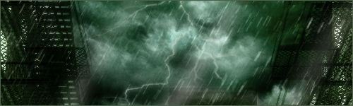
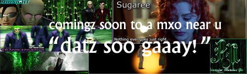
Hey! So now that I have introduced my PSing skills (or lack of) in HostileIntentions Sig competition thread, it thougt it was time to create a thread so that you guys can comment on, give advice or even enhance some of my creations. I'll start off with a few sigs I have made recently. Some are for my alt C4SHM3R3.
I would really appreciate your comments and/or advice on how to further my skills.
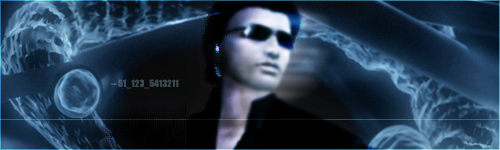
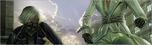
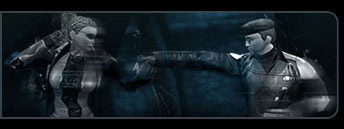
All are pretty good but this one's reflections on the glasses is too strong. It needs more transparency. Also the lighting spot on the left side of the glasses is too strong.
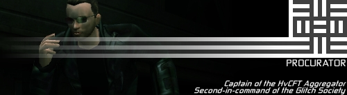
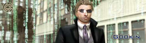
You know my opinion on the first one: Sharp man, sharp. The second one is very hazey, dawn like, plus a very nice shot in general, crisp. I really like it. The textures on the 3rd one blow me away, I love the clothing details, and the green on white code is a very nice change of pace.
All in all, you've got some impressive stuff there. My only advice would be to perhaps lightly smudge any aliased textures out, like on the rim of hi glasses in the first one, and around the corners of his face. Keep it up, dude.
Thanks for the feedback people. I'll be putting all the advice into praactice for my next project which will hopefully be a decent big picture of Gookin AND C4SHM3R3 together. If I can pull it off of course.
Yeah, basically just the smudge tool, set to like 1px, soft, and just add depth to the hairline. Then thicken it smudge a few pixels, and work the end of the hair until looking good. Make sure though that the hairs narrow at the end, so you don't get spaghetti, Raggety Anne hair.
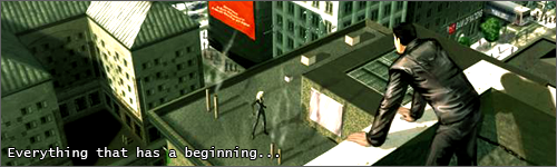
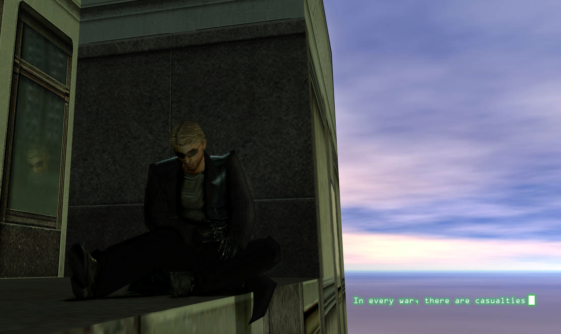
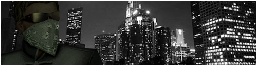
New pic. For those of you who have been following my story in Syntax: Next Renaissance, this contains a small glimpse into future chapters of the story!
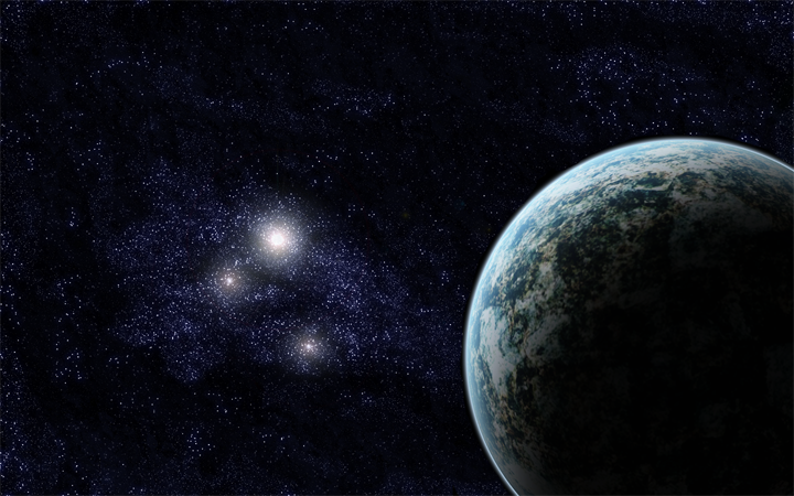
Ok so I decided that, this afternoon, I would randomly play around with things in Photoshop. Once something had begun to take shape, I 'ran with it' and managed to make this! (Note: The real size is 1440x900 px to be my desktop background. This image has been resized.)
It's hot, but not a very good contrast I think. Try bringing out the colors a little bit more, that ought to do it. Though I'm having a hard time seeing what you actually did to the picture, perhaps you could post the original?


![Image</font>
</body>
<!-- Mirrored from forums.station.sony.com/mxo/user/signature.m?user_id=10997 by HTTrack Website Copier/3.x [XR&CO'2008], Sun, 21 Jun 2009 06:41:17 GMT -->
<!-- Added by HTTrack --><meta http-equiv=](/mirror/img149/7219/frostvpi8.png)