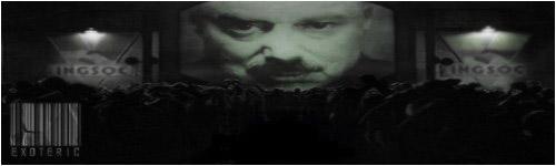
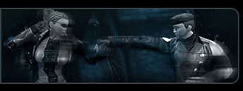
I'm three days into a 30-day trial period of regular 'Residual Self-Image' guest star, Photoshop. These two images represent the extent of my knowledge thus far, hence why Sykin/Pyraci and the like will quietly mock any obvious, simplistic errors throughout.
Scathing criticism welcome, I'm here to learn.
The aesthetics of location(s) will improve as time goes on, I just had the idea for the metaphor behind this one, and knew I wouldn't be hampered by complex lighting conditions on my first attempt (despite the finished lighting being admittedly far from perfect):

The title of this piece highlights the underlying metaphor (which hopefully the majority of you will understand, otherwise it doesn't work as well), and dictated the aesthetics.

Any comments/tips welcome and appreciated.