5 posts · 2006-07-25 19:07:45 to 2006-07-26 15:14:30
#3630000673507/25/2006 19:07:45Opinions and ideas for this:
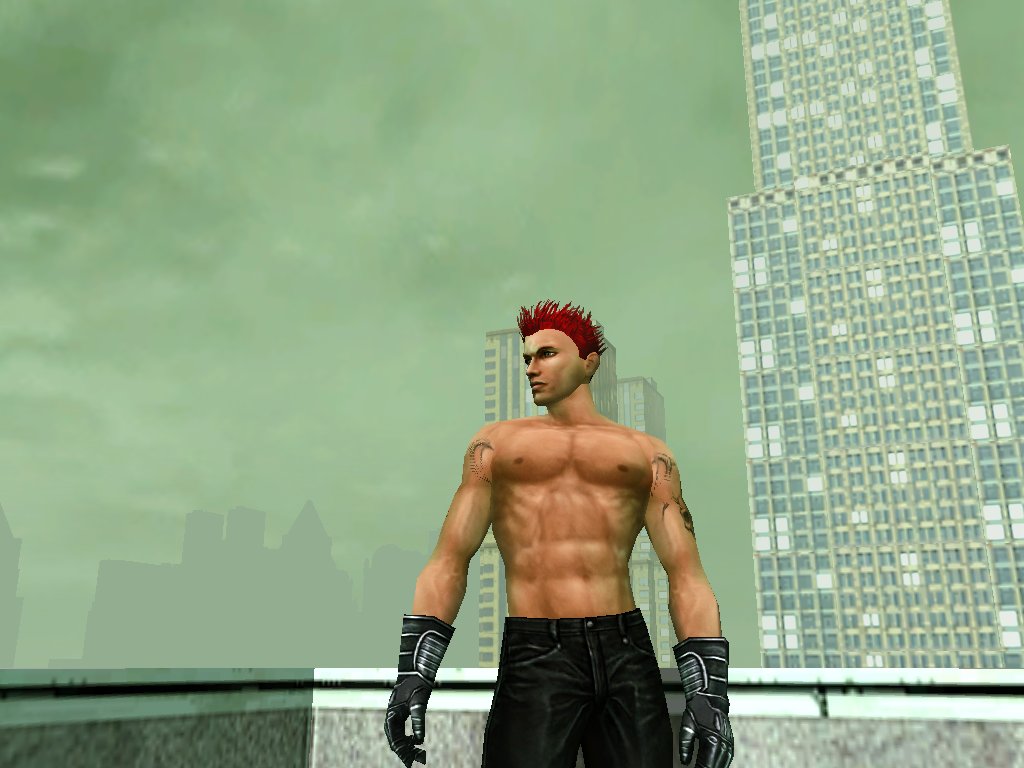
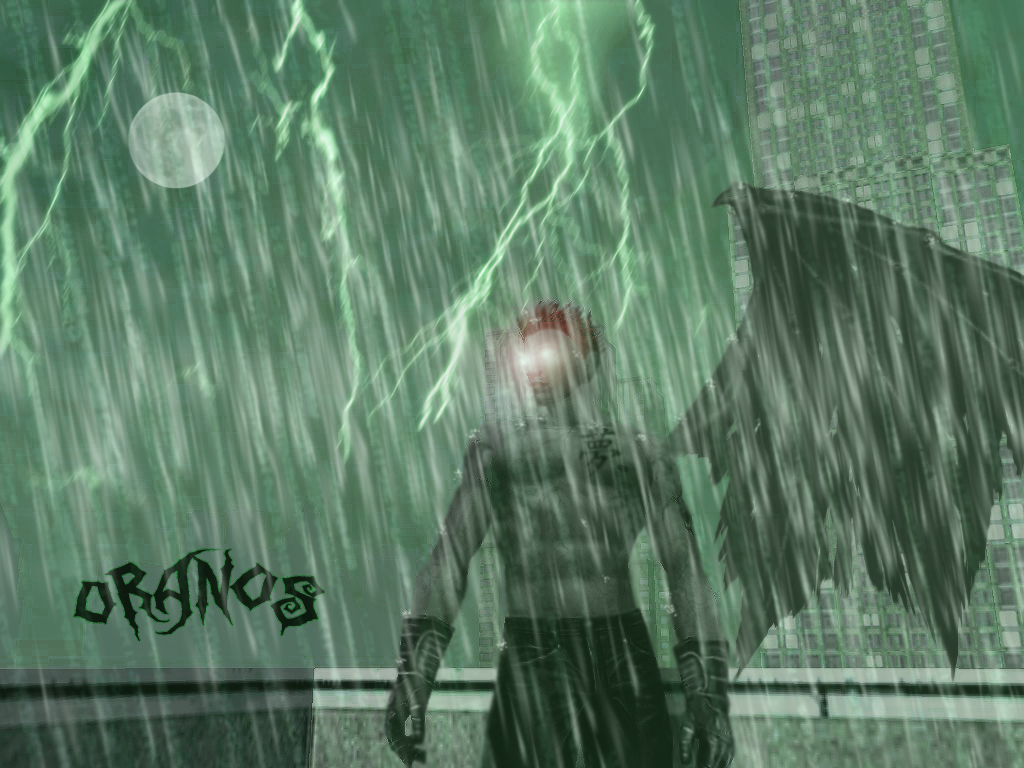
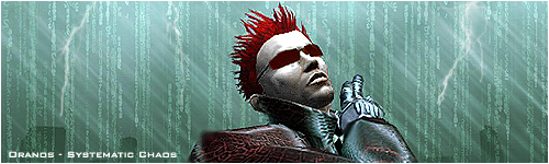
A few days ago I was bored and started messing with screens I took for a sig. Here's the original:
Anyway I started to mess and got this:
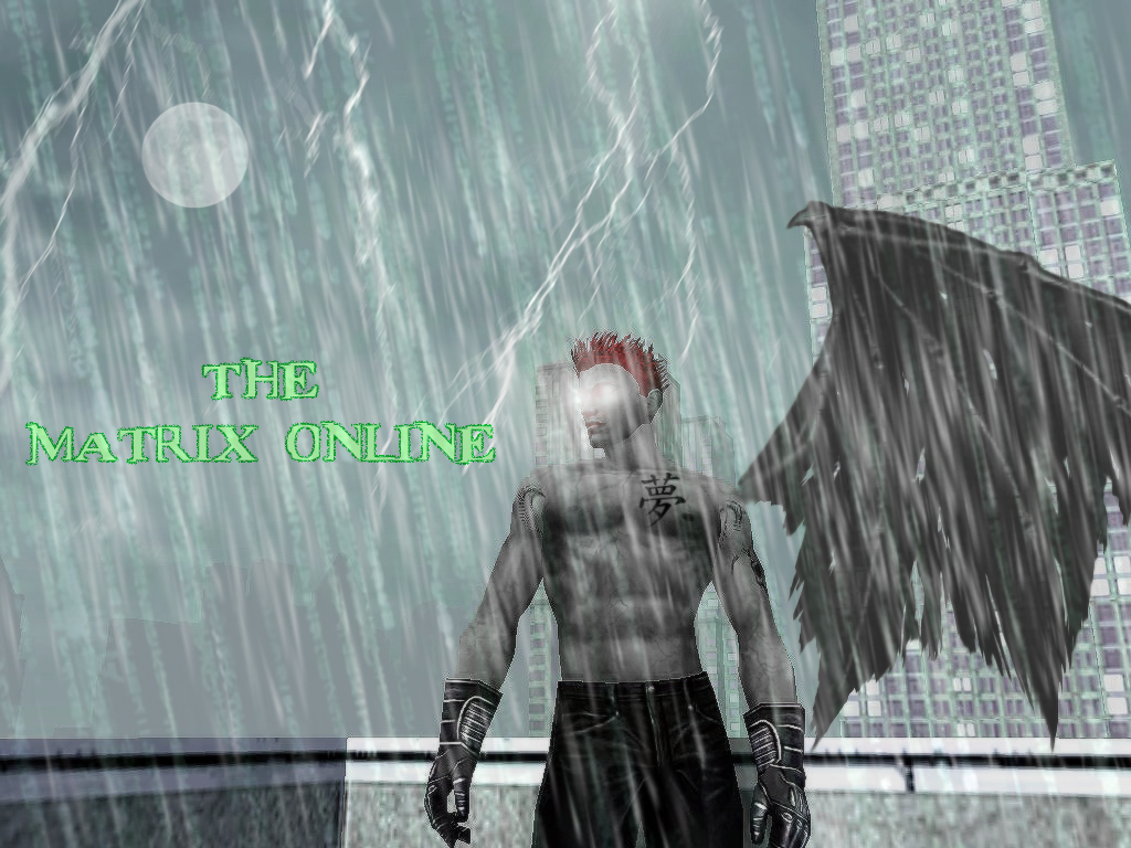
After a few more versions its turned into this:
I can't think of anyways to improve it, so I was wondering people's opinions and criticisms of it.
#3630000698607/26/2006 10:26:40Re:Opinions and ideas for this:
I like the concept.. the 2nd color scheme is better because you can see more of your RSI, the green effect on the last one added with the glow of the eyes makes it take away from the rsi himself.
The wings don't look like there attached or part of the rsi.. just look like there pasted next to him.
#3630000700407/26/2006 10:43:00Re:Opinions and ideas for this:
no edit button !! lol
overall 7.5/10
the wing part.. i would maybe take the wing section and bring the end of the wing touching his body more towards the center of his spine so it looks more centralize and behind the rsi as if its part of him.
#3630000719207/26/2006 14:52:07Re:Opinions and ideas for this:
Thanks for the tips. I'll see what I can do about the wings.
The green however is because of the Matrix. I'm not really trying to make the emphasis on the RSI only.
#3630000721507/26/2006 15:14:30Re:Opinions and ideas for this:
I get ya on the green scheme tying that in with the matrix.. the lighting bolt above/close to his head/face, maybe shorten the length so it ends above his head a lil and fix with the wings would make that shot for a 10/10