This idea was spawned by both the "Rate my sig" thread, and the recent interchange on signatures on Fondo's latest thread. The idea is:
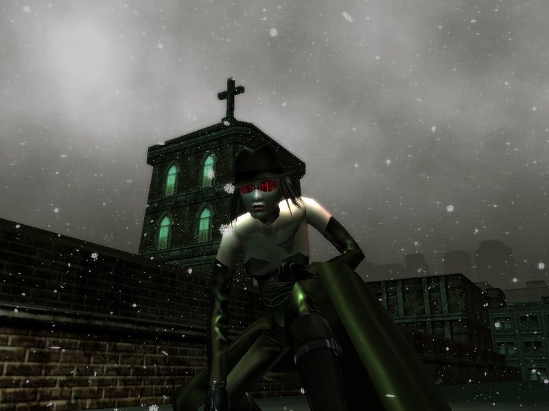
Someone posts an image, their RSI, scenery, or anything else thay want made into a signature. In addition, they add any information, quotes, etc. they want included in a signature.
The person under them makes that image into a signature, and then posts their own picture.
The process endlessly repeats itself.
Why? There are a multitude of really really different, and cool styles on this forum. This will allow designers to have signatures not only in their own unique style, but those of others. So...welcome to the exchange!
EndlessVoid wrote: Now, if only someone would post an image to start things off...
Go for it.
- Void
^ It's pretty huge though.. First reply to the thread..
Easy to see, besides the fact that it looks like its size is 1x1 pixels. I had to press reply and then quote the post, since pressing that minimal dot brought me to imageshacks homepage.
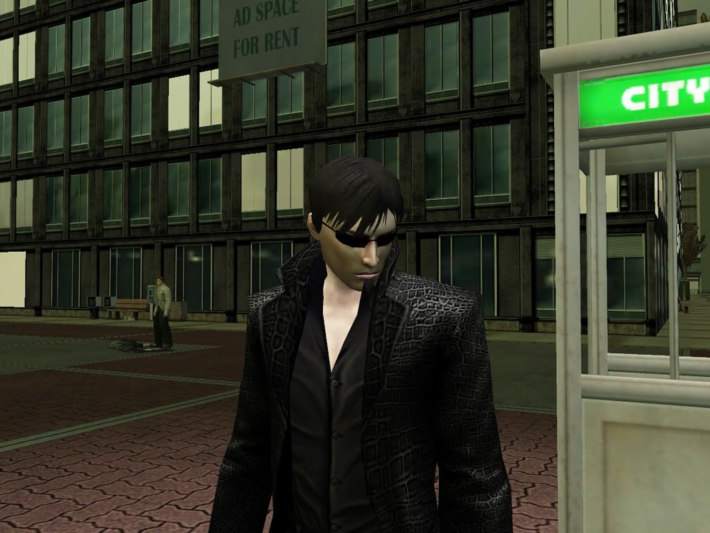
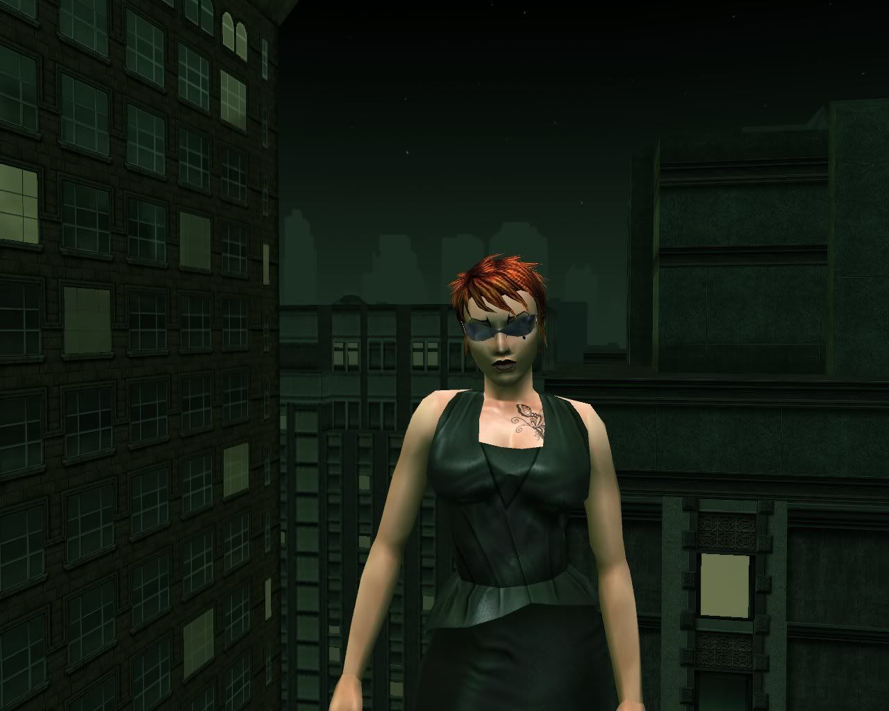
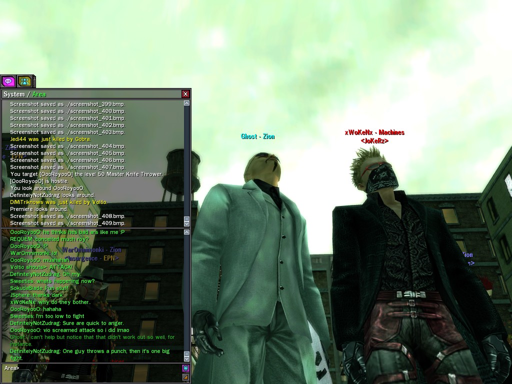
I don't have any skill with sig's to offer an exchange but I'd love to have this pic cropped into a sig.I could always offer a little help or info on vector in return if needed.
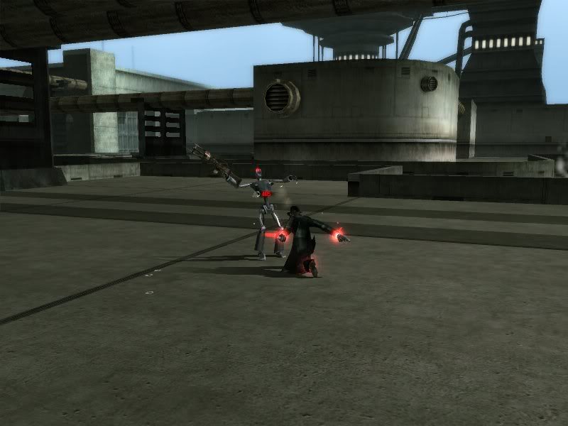
I'm notorious for my wry, random humor and for finding strange things funny at three in the morning. The following, unfortunately, is a by-product of this.
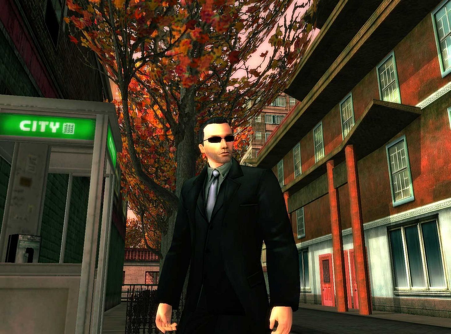
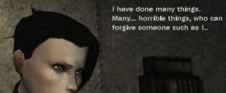
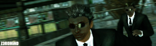
And I've been wanting someone to make a good sig for Morraeon, so...:
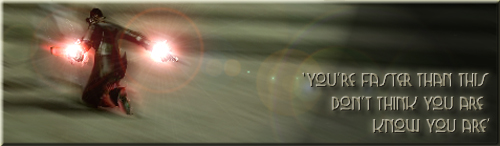
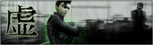
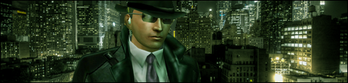
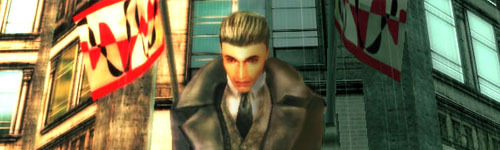
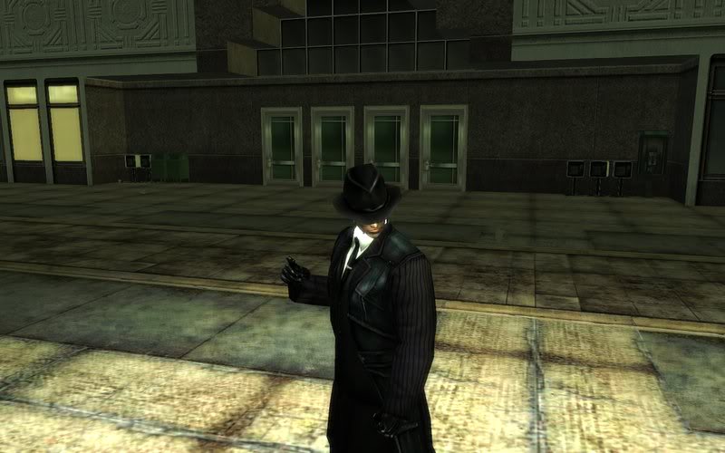
I enjoyed this one. Gave off a very vintage feel with the outfit so went for a gangster sort of feel to the signature. Anyways seing as I am becoming addicted to this thread. Might have to set my own one up soon lol!
Hope you like. Enjoy!
Ra2za
______________________________ The Problem is Choice_______________________________
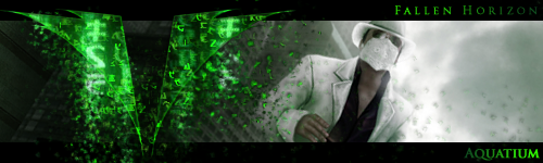
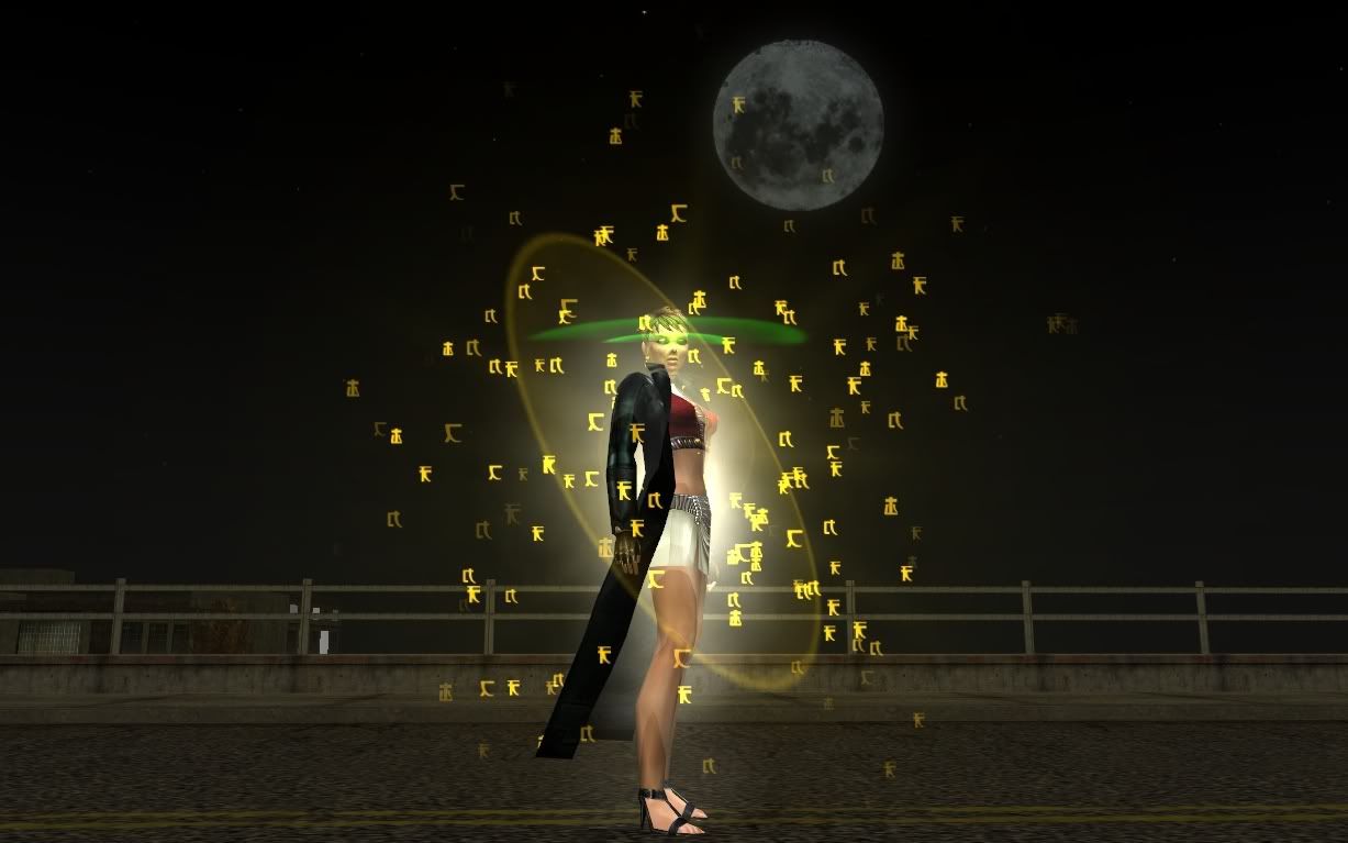
I enjoyed this one. Gave off a very vintage feel with the outfit so went for a gangster sort of feel to the signature. Anyways seing as I am becoming addicted to this thread. Might have to set my own one up soon lol!
Hope you like. Enjoy!
Ra2za
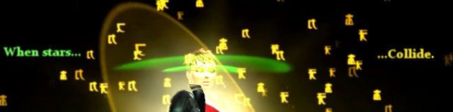
Those are absolutely beautiful !
*edit* Now that I see them on the black and on the gray background... I'm thinking they might need a tiny white border or something. They look perfect and seemless on the black background, but on the gray, they miss something. Wish our phorums would stick to one color. :/


 .
.


 " /> ...a lot.