Rate the perosns sig above you.
what do you rate mine.
what do you rate mine.


52 posts · 2005-08-15 19:09:53 to 2007-01-27 06:52:00

Message Edited by TetraCleric on 08-15-2005 10:23 PM
Message Edited by LongD on 08-16-2005 12:26 AM
Message Edited by Plummet on 08-16-2005 01:39 AM
and 1+2=3
Message Edited by LongD on 08-16-2005 02:14 AM


nice one Globin, i'll give it a 10/10 cuz it looks freaky 
this product i picked up from one of the megacity groceries!!

Message Edited by PBlade on 10-25-2005 09:05 AM
who is guna rate my new one. for hallween. took approx 1 hour.
and also. watch out for my sig's for the Mods. im sure you will like
10/10cheers dude's 
haven't seen you in a while hagel. You on another sever... love the sig by the way.
save me the convertible version


its cool but why did u try to make ur self look like vegita ? lol :smileyvery-happy:
Dragonram wrote:
C'mon it's Pyr, gotta give it a 10! :smileyhappy:
*prays his rotator doesn't throw up a crappy sig*
-Ð
why am I looking at your denim, cargo *CENSORED*?
Anyway, my sig priveleges got removed without warning for being a naughty boy.
Message Edited by gunslinga on 04-02-200609:50 AM
ZippydaSquirl wrote:
Here's a new one:It's .jpg and in MsPaint, so leave me alone! *tear* I hate Photoshop, but only because it's too much effort to get it.
The thing is a god once you get the hang of it! 
DevilsAdvocate666 wrote:
8/10
rate mine!
0/10
I do not find it funny whatsoever as someone here on the forums may have a mentally ill family member. Maybe you think its funny to laugh at those less fortunate, but keep it to yourself.
Message Edited by Gman2200 on 05.30.2006 12:54 PM
Message Edited by Llywela on 06.16.2006 12:49 AM

Nice new siggy !
9/10 like it alot, getting better and better pb!
one day i'll actually spend some time getting my *CENSORED* sorted and make me a decent sig, untill then...

Cool and Comic'ish, I like that style. Im just trying to figure out exactly what happening, even if I can see what everything is, my head hasnt figured out how yet. ^^
Here are two I made for a friend, couldn't really decide on what to do, so it ended up being two variants of the same picture.


Not bad but it is a lil bit hard to read. I give it a 7 :smileyhappy:
i like !
nice simplistic feel and great work on the pic 9/10

/cheers Phace
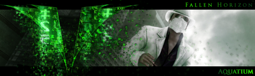
4/10, Good job, this being your first real sig, but personally im not a big fan of the Matrix Font in anything but the movie title, so I guess its kind of unlucky that im the person rating your sig also, i would do a VERY slight blur so that it isnt so edgy (for lack of a better word
rate?